Accessibility Guidelines
Introduction
What is Accessibility?
Our mission at Spotify is to allow billions of fans the opportunity to enjoy and be inspired by artists' work. Because our applications are for everyone, product a11y is now a core focus for Spotify. As developers extending the Spotify experience to our communities elsewhere, we have the responsibility to our users to create a safe and equitable space for them, regardless of the manner in which they use our applications and interface with their devices.
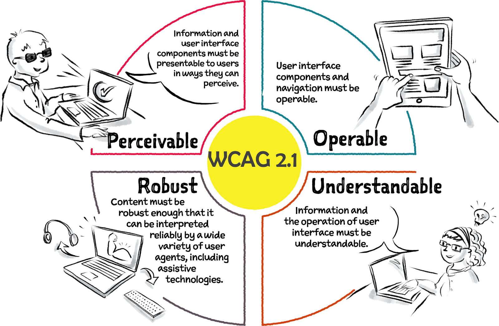
Abbreviated version of The WCAG map by Intopia.
“Who might this experience exclude?” is a question we answer every time we make implementation choices in our applications. In everyday life, stores that can only be accessed by a staircase have actively made the decision to exclude wheelchair users, parents with strollers, shoppers with wheel bags. Every design decision is a stance on inclusion, or lack thereof.
Susan Goltsman, co-author of Play for All Guidelines and The Inclusive City, has popularly described inclusion as allowing a variety of ways for people to experience one thing (like your application), rather than availing only one experience for everybody.
If your end goal for the “who might this experience exclude?” question is to get to the answer “no one” - then this is the right guide for you to use to deliver a high quality application that is at par with Spotify’s core value of inclusion for all.
Testing accessibility manually is indispensable as automated tests will only catch a small percentage of issues and will not validate the experience as a whole.
Accessibility in the Software Development Lifecycle
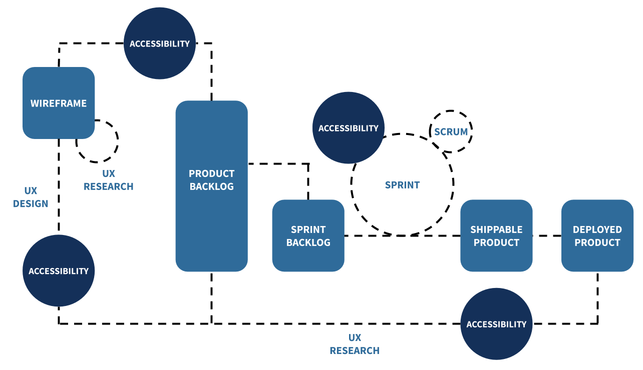
A11y done right results in high quality applications. Prioritizing a11y early on in your development process reduces regression and ensures your application includes everyone from the onset.
The image below is Jason Dippel’s take on baking accessibility into the early stages of your software development lifecycle(SDLC). We agree with the recommendation that accessibility should be baked into the SDLC as follows: _ between the Wireframe and Product Backlog stage as part of the User Experience Design process, _ as part of Sprints that then inform the Sprints Backlog and between the Product Backlog and Deployed product as part of the User Experience Research process,
effectively saving you time and money down the road.
How to Use this Guide
This guide will focus on levelling up your skills so that you can identify a11y gaps in the applications you have already developed and work to fix them, or use the tools in this guide as you begin to develop a new application.
The guide is divided into three sections, all designed as task lists to guide you on your quest to create a high quality and accessible application. The sections are organized in order of ease of implementation, but all recommendations are equally important and should be prioritized in your application development. They are:
Quick Wins
Accessibility quick wins are modifications that take a short amount of time to implement in your application as a first step to making it more accessible for all.
Alt-text in Images
All visual and non-text elements (images, GIFs, graphs, charts) in your application should be accompanied by alternative text (alt-text for short), which is text that describes your non-text elements in detail, providing necessary context for assistive technology users.
A11y Actions:
- Add the alt-text attribute to all your image elements, for example,
<img src="https://developer.spotify.com/cats.gif" alt="Two kittens playing with a ball of yarn" /> - Alternatively, write detailed captions under your non-text elements
- For purely decorative images on a page, consider adding an empty
<alt="">attribute so screen readers can skip them altogether
Resources:
Animations
Animations on the web and mobile have been known to trigger seizures, induce nausea or trigger headaches and more. It is also not uncommon for users to turn animations off to meet their preferences, for example, optimize their device performance or save battery. As such, it is important to incorporate animations in a way that is inclusive of all without causing harm.
A11y Actions:
- Adopt the three flashes or less recommendation from WCAG, which stipulates that your animation should not have any more than a maximum of three flashes in a one second period.
- Give users full control of the animations in your application, so that they can pause the animations, stop the animations or hide them from a page altogether should they prefer to.
- Where user interaction on a page i.e. scrolling up and down triggers animation, add provisions to disable or reduce this motion-induced animation.
Resources:
Buttons
Buttons are an important way to deliver calls-to-action to your application’s users.
A11y Actions:
- Icon-only buttons should include button labels to provide context around button actions.
- Disabled buttons are often used to communicate that an action needs to be completed first before moving to the next step. However, disabled buttons are inaccessible to screen readers and often, it is unclear to an assistive tech user what the final outcome of completing a couple of steps is. Adding labels that describe why a button is disabled and what needs to happen to enable it is a good first step.
- With button sizing, make sure to provide a large area for user interaction, for example, in iOS the minimum touch target size is 44x44 points, and in Android it is 48x48 points.
- Consider using in-built button elements by default (on the web as well as on mobile) as they have predefined styles and a11y features like touch target size, tab focus, focus highlight and interaction shortcuts (not everyone uses a pointing device to interact with components) written into them.
Resources:
- Accessibility guidelines on links, images and other clickable elements
- Find detailed recommendations about share buttons and best practices around them in the Share Buttons section of this a11y guide.
Color Contrast
Color contrast is a measure of how different colors are from each other - colors that are opposites have the highest contrast and those that are next to each other on the color wheel have the least contrast.
A11y Actions:
WCAG recommends that
- the color contrast between background and foreground elements should have a 4.5:1 contrast ratio,
- icons for user interfaces that are essential should have a 3:1 contrast ratio.
Resources:
- You can use this color contrast resource by WebAIM to guide you on what ratio to aim for.
- You can use WebAIM’s color contrast checker tool to confirm that the colors you are using are appropriately contrasted.
Headers
Page headers are primarily how screen readers and other assistive technologies navigate pages on the web. Correctly identifying page headers makes it possible for assistive technology users to get a quick overview of what’s on the page and jump to the sections they are interested in.
A11y Actions:
- Use HTML markup to identify page headers. For example, here are guidelines on using the
<header>element on the web - Organize your headers hierarchically, being careful not to skip levels i.e. H2 should come after H1, do not skip to H3 or H4 after H1.
- On native mobile apps, you can also configure anything that represents a header as a heading to let the users quickly explore what the screen has to offer and speed up navigation, by jumping from one to another with a simple gesture.
Resources:
- Web Accessibility Initiative (WAI) Guide to Headings
- Digitally Accessible Headings by Princeton University
Modality
Modals are pieces of information that pop up, and are commonly used to nudge a user to complete a specific action, or to provide more information.
A11y Actions:
Because modals are informative but also disrupt the flow of information on a page, it is important to give the user full control over opening and closing modals throughout your application. An accessible modal is one that
- provides the right information to screen readers
- manages keyboard focus properly You can use HTML and ARIA to serve semantic information and work with JavaScript to change behavior and CSS to dictate appearance.
Resources:
Multimodality
Important information should be conveyed in multiple modes, that is - color, haptics, sound, through messages and iconography - so everyone can perceive it.
For example, consider a text box in a form that is highlighted in red when the user enters invalid information: colorblind users may not perceive it and screen reader users may also miss it if it is not actively configured by developers. Adding some messaging next to it with specific information on why the information entered is invalid and how the user can fix it, will make it much easier for everyone to identify. Redundancy helps in this case. The more modes your information is presented in, the easier it will be to understand.
Resources:
Order of Actions
If your application presents the user with a choice of actions at any point, be sure to present the least destructive option first from the range of choices, for example, when asking the user to confirm their selected action to delete a playlist, the OK option should be highlighted first instead of the CANCEL option; or if you have CANCEL and CONFIRM as options for the user to pick from, highlight CANCEL first because remedial actions are easier (when one cancels, they can redo a task.
Resources:
Share Buttons
Providing ways for users to share your application across different social media is one of the most common ways to spread the word about your application and draw users’ attention to it. A minimalist / common approach is to use hyperlinked social media icons to achieve this.
Accessible icons are images which can be accessed equitably and whose function can be understood clearly by all application users. To make your icons accessible:
A11y Actions:
- Add alternative text to your icons that describes their purpose i.e. what to expect on click. For further reading on alt-text best practices, see the images and alt text section.
- Choose icon colors that have high contrast to your background and see the color contrast section for more detailed best practices.
- Provide clarity by including accompanying on-screen text, usually a one-word descriptive label, next to your icons.
Resources:
Medium-term Wins
Medium-term wins are modifications that take a bit more time to implement in your application than accessibility quick wins. These are key, and we strongly recommend that you prioritize incorporating them into your application.
Navigation
Structural presentation of a menu and its items i.e. in a list gives a good basis for assistive technologies to pick out menu items and serve corresponding functionality to assistive technology users. Coding menus semantically makes them adaptive to different scenarios i.e. different-size screens, varying zoom/ magnification levels and access via different assistive technologies.
A11y Actions:
- Place your menu in one consistent area across all pages in your application
- Label your menus so they can be understood and differentiated easily
- Highlight the currently selected / active item in your menu using HTML or ARIA i.e.
- See the Order and Grouping section for best practices around grouping and ordering menu items
Order and Grouping
Grouping related items in your application makes it easier for screen readers to keep track of progress and overarching context as a user navigates the application. Any items that are grouped visually should also be represented similarly semantically.
A11y Actions:
- Ordered and unordered lists
- Use unordered lists for menu items where content can be accessed and consumed in random order, and
- Use ordered lists for menu items where systemic navigation matters
- Adhere to rules of lists
- Only have list tags (
<li>) as children of your ordered and unordered lists. Avoid adding other types of elements to them.
Resources:
Semantics
Semantic elements are those that provide context about the nature of content held within them and include elements like <header>, <cite>, <section>, <p>, <footer>, and more while non-semantic elements like <div> and <span>do not provide context about what to expect in them.
The four properties that constitute a semantic element are
- name (an element’s label),
- role (describes an element’s function like input or button),
- value (complements the role i.e. input=text) and
- state (communicates how elements are configured i.e. enabled, collapsed, etc).
A11y Actions:
- Swap out all your non-semantic elements like
<div>and<span>for semantic elements
Resources:
Intensive Wins
Intensive wins are modifications that take a bit more time to implement in your application than accessibility quick wins and medium-term wins. These are key, and we strongly recommend that you prioritize incorporating them into your application.
Master Assistive Technologies
Pick an assistive technology and get good at it, for example, talkback technology like voice-over or NVDA which is Open Source software (OSS) with lots of free examples.
Master States in Accessibility
As mentioned in the Semantics section, states are a semantic property assigned to elements that specify how content in an element is configured i.e. may be checked, enabled, expanded, hidden, current etc.
States and properties are categorized in four: (i) drag and drop attributes, (ii) live-region attributes, (iii) widget attributes and (iv) relationship attributes.
A11y Actions:
- When defining elements, although optional, it is best practice to announce state for the sake of assistive technology users.
Resources: